The Magic of Paint, our easy Bathroom Renovation.
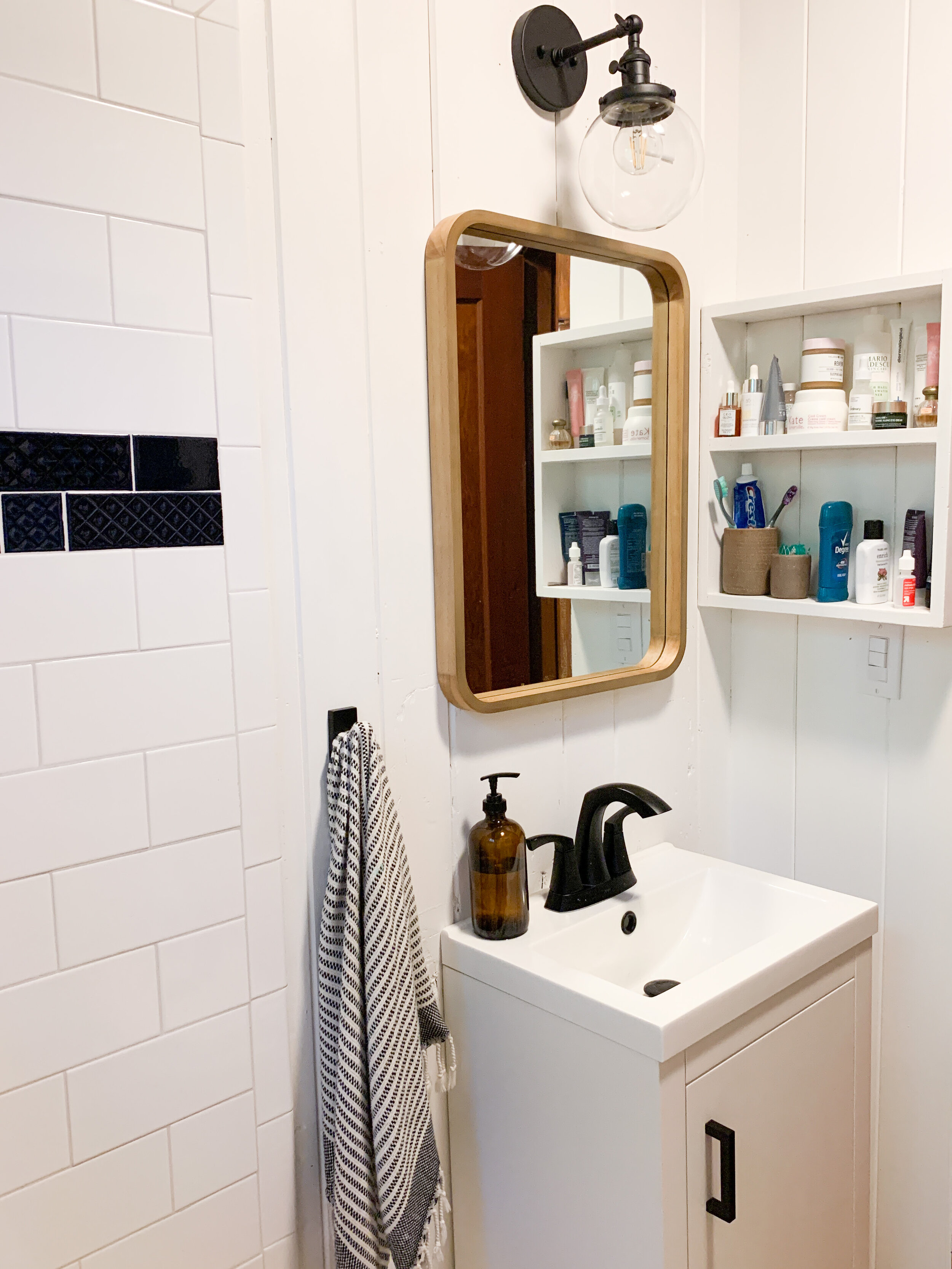
When we moved into our house last August and I gave a brief tour of our new home, I purposefully left out photos of our main bathroom as it was the room in the house that definitely needed the biggest facelift. Starting back in January and finally replacing the last electrical outlet at the beginning of May our bathroom now has a whole new look and is feeling so much better!
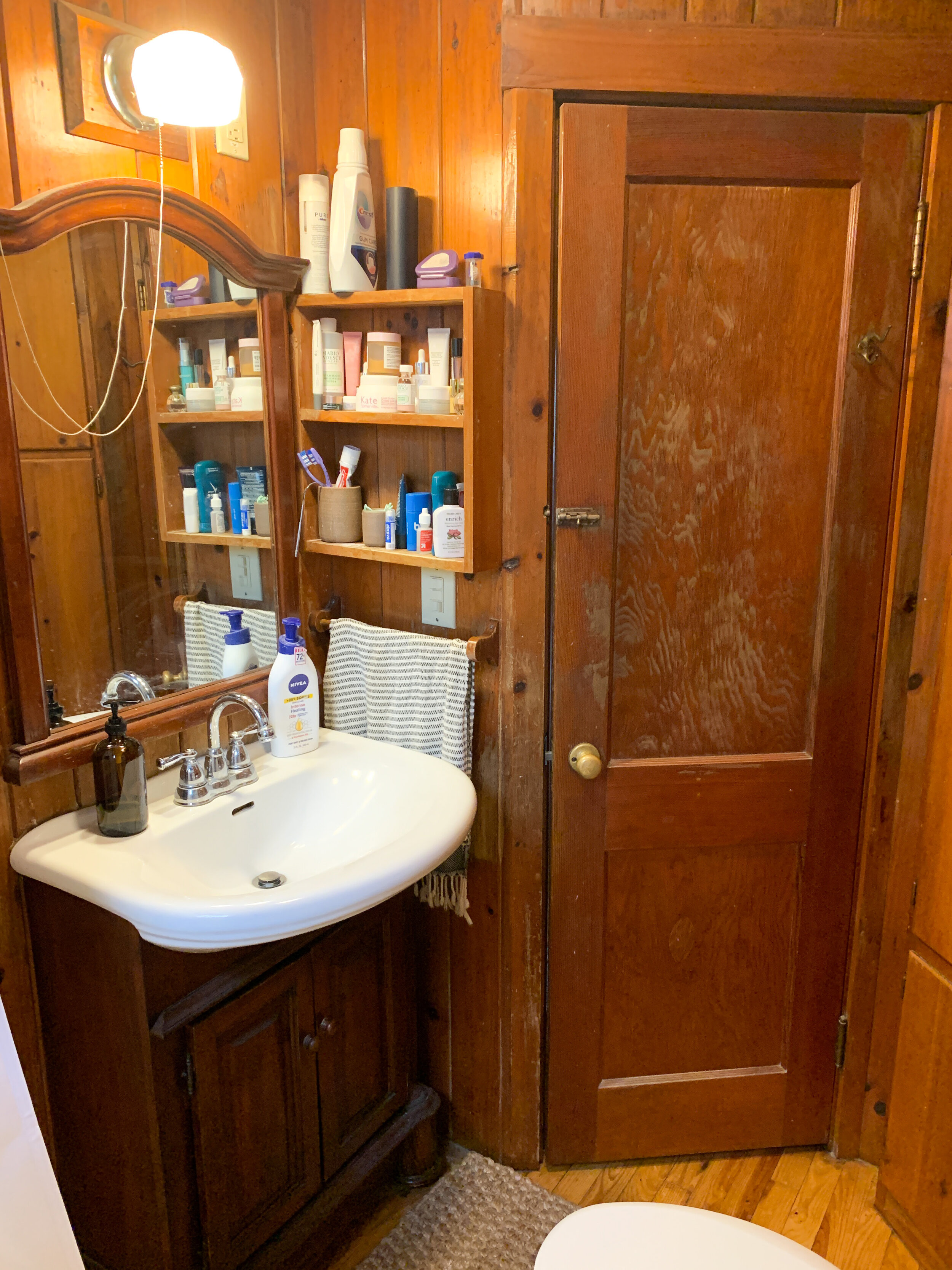
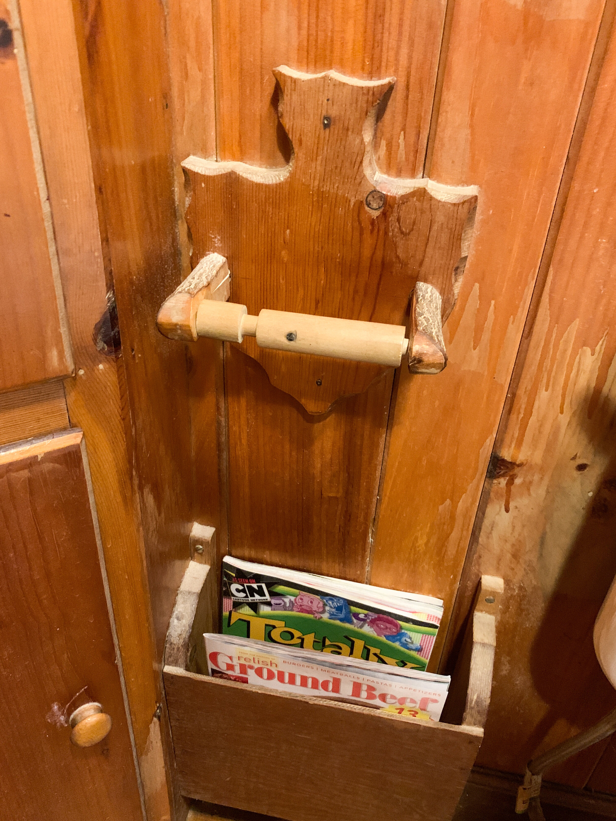
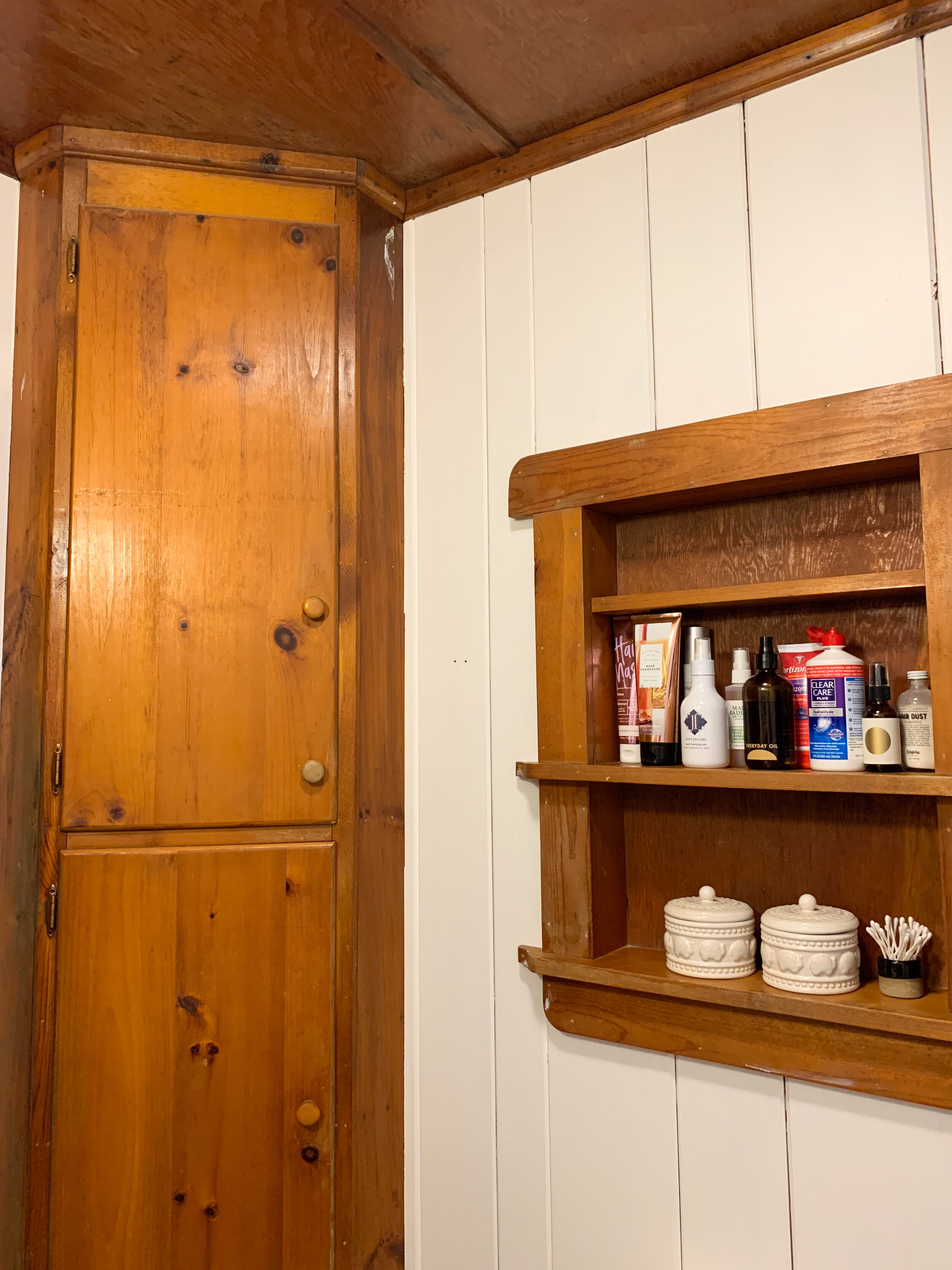
As a reminder, our house was built in the 1950s and the bathroom was one of the rooms you could feel that the most. While there were aspects I loved, like the original tub (maybe that’s it), it was pretty claustrophobic with the wood everything, and a not proportional vanity. While the arrowhead toilet paper roll and built in magazine rack were kitschy and amusing at first, they truly needed to go!
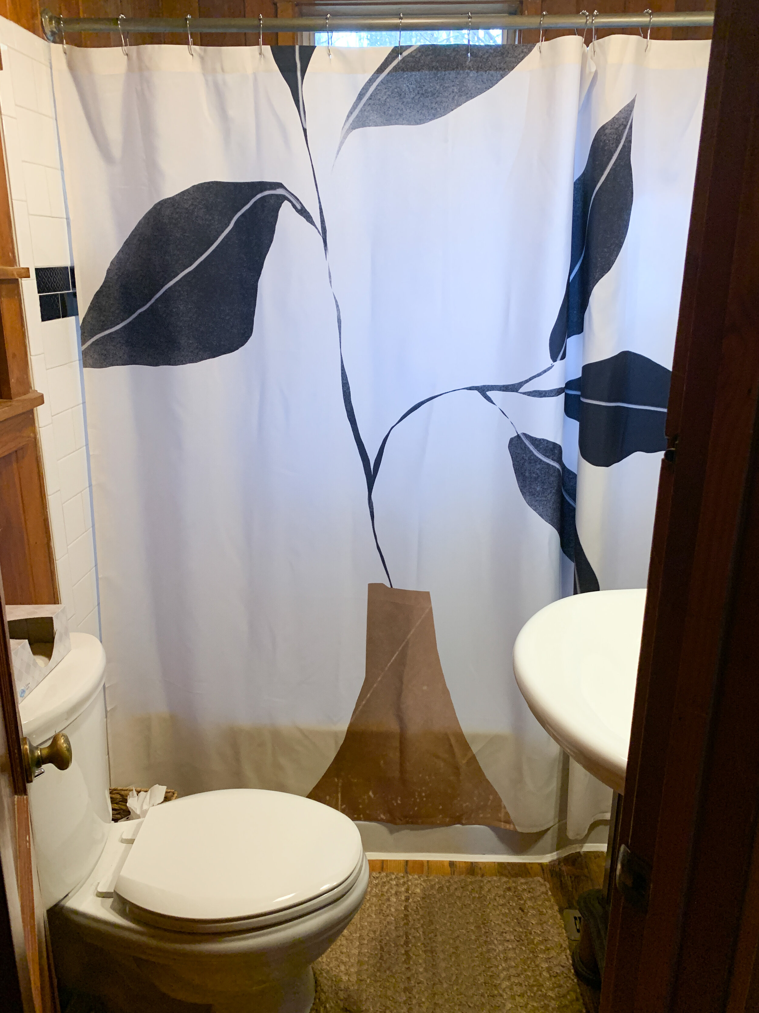
Now that I never have to look at it again, here is a look at how our bathroom looked before. The last before photo is even after one wall was painted white, so imagine EVEN MORE wood.
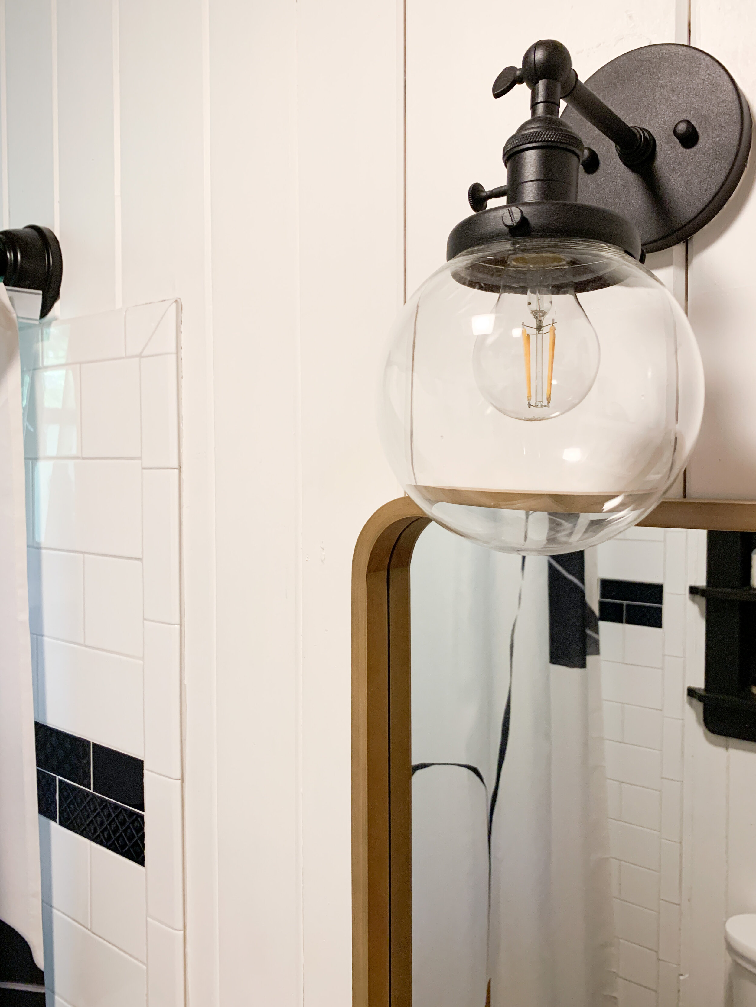
For me this bathroom upgrade was very easy and relatively low lift, only really requiring a few coats of paint and some hardware updates. For Andrew it was a bit more extensive being the one responsible for plumbing and installing a new vanity (which is relatively easy by the way, so don’t be intimidated!) and handling the rewiring of the electrical with a new sconce above the mirror and swapping out the electrical outlets.
The starting place for everything was finding a smaller, more functional vanity to attempt to better utilize the space - knowing with my growing belly and the day when both of us would want to attempt to be in the bathroom with our baby made this the top priority. While I’m happy with it, I can’t say this is my dream vanity, but the measurements and price point fit well into our plans, and we still have some functional storage space in it, with also adding in lots of extra inches in space on all three sides.
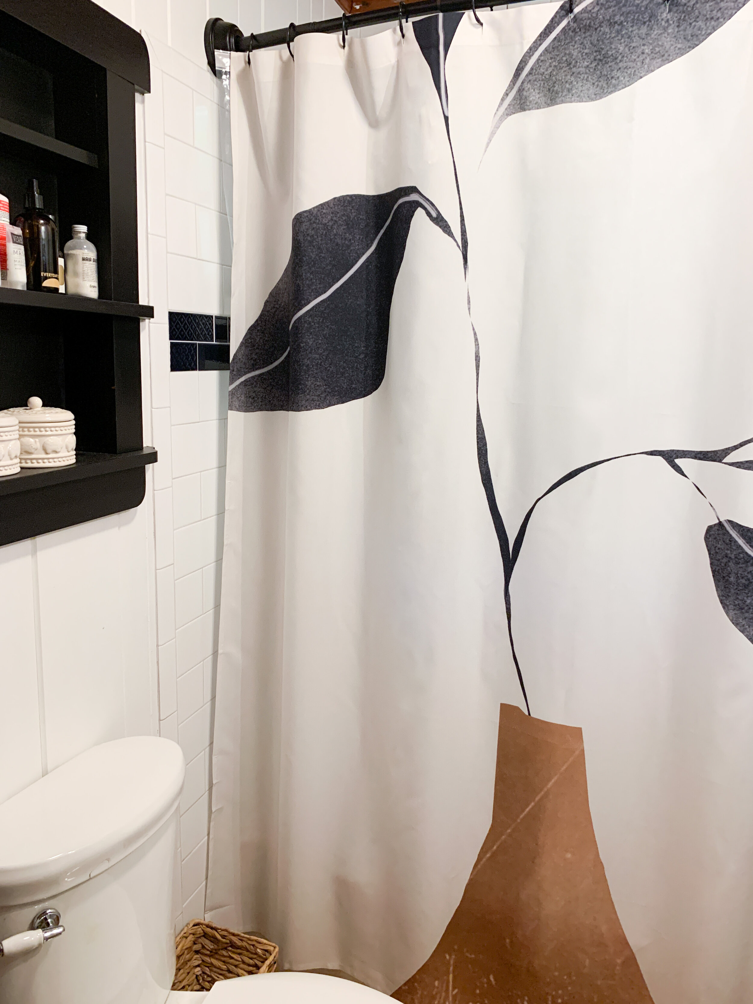
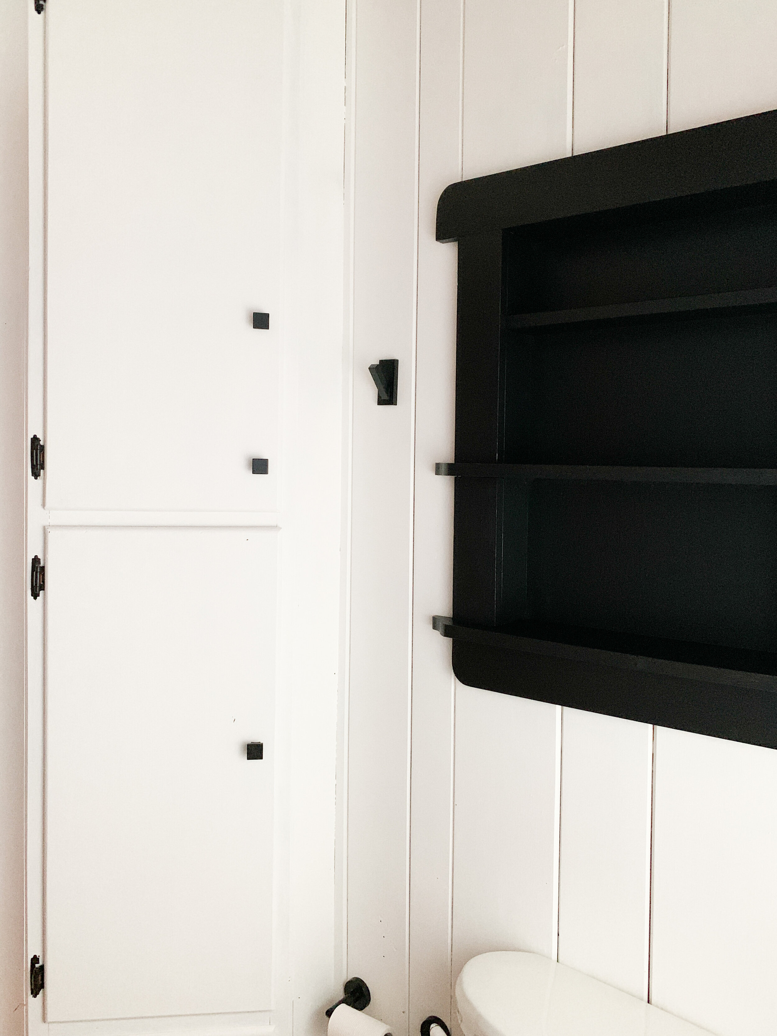
I’m obviously a fan of neutrals and black and white as you can see some of the decor elements like our shower curtain and hand towels stayed, but this decision was made easy by keeping the project more budget friendly and leaving the shower tile as it was. The tile shows on both sides, so there was really no avoiding keeping it as part of the overall look. We used some white paint we had from painting our living room and some black for the accent shelf from what we had from renovating a dresser in the fall so outside of that just needed to update curtain rod, hooks and hardware and find a light fixture and faucet we liked, and voila!
From there, you can see where we ended up, with this bright, neutral after! What do you think?!
Society 6 Minimal Plant Shower Curtain, Amazon Globe Sconce, World Market Jute Rug, Hearth & Hand Wall Mirror, Olive & Linen Turkish Towel
I get commission for purchases or clicks made through links in this post.


